|
The alternative music world has lost a visionary artist that worked behind the scenes for 4AD Records. This eccentric record label has launched the careers of The Breeders, LUSH, The Cocteau Twins, and The Pixies. His work was at times intricate and delicate with the most petite and pristine typography placed against chaos and backgrounds bathed in light. Vaughan Oliver, created lush environments. At times they were industrial and gritty and other times they were dreamy and atmospheric and based in some unspecified time. That was the purpose I suppose and that was to overwhelm and tantalize.
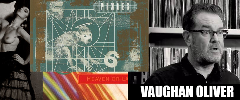
I discovered his work in college when I grabbed a copy of Surfer Rosa by the Pixies and was somewhat hypnotized by it. Here was a soft brown duotone image of a young Mexican woman with perfect breasts…. On a rock record. The album itself had left me at a loss for words too because it was so stark and rough. To be fair I met the two of them in one shot and it was a real departure point for me. On the radio all you heard was The Who, Motley Crue and Def Leppard and meanwhile there was something else taking off and that was Alternative Music.
These were the rockstars you could walk up to after the show and meet in some cases. Like when His Name Is Alive came to Detroit and then hung around after the set and met the fans. 4AD bands were approachable as opposed to big name arena rockers. You could get in the first row at the Pixies at Saint Andrews Hall and actually experience the bands first hand. The walls came down and there was no pretentiousness about any of this. Behind all of these dazzling record covers Vaughan Oliver controlled the scene but not in some manical egotistical way. Oliver was in his own element and that was pure art.
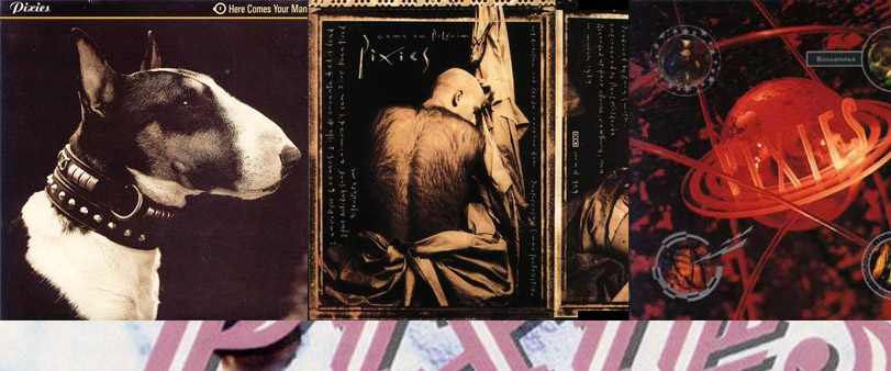
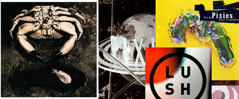
I knew Vaughan Oliver to be synonymous with the design label v23. Growing up in college and design school I was very much a fan. When I wasn’t listening to the bands on the 4AD label I was in the shops looking for the latest Pixies t-shirts and collecting records on vinyl. His work would sometimes feature dogs with studded collars looking fierce. This was juxtaposed with elegant serif white type and it then deserved a second look.
The other looks he would come into were interplanetary in nature along with plastic kitsch. There was a youthful toy like quality with some of the work like the Pixies Veloria era. Then there was a great thing where we had singles and extended play albums during the late 80’s. Oliver would design those too as well as the linear notes and sometimes the record label art. The CD’s had books included in the packaging. It was like opening up a special gift. They always demanded a second look and a very detailed inspection. You almost did not want to miss out on anything.
Every band from the 4AD label got a high end artistic treatment and that includes the lesser known ones. Sometimes this include special considerable treatment done to the typography. Every finished record sleeve carried a conversation in its own right. I remember a term being loosely kicked around called Pluralism. That to me meant that a lot of great elements could be blended together to make a certain artistic look. Some of the colors would be blurry and then it would carry some crisp typography, (some of the fonts were even uniquely constructed) and the finished look would have its own style. For me it went beyond the classic definition with international art influences.
Along with emerging digital technology, (which was new in 1989 – 1993) there was the old media meeting new media. That meant playing with visuals like television static, on screen projections, digital video, digital images, as well as printed media. Using a complex array of spotlights and gels and innovation this became incorporated into a totally new visual environment. His work made you feel like you were alive. Then in another way it took the audience into a new visual experience. In short, the visual work enhanced the music.
This didn’t always carry over onto video. Although it could have had there been more budgets. I was disappointed when the Pixies released, “Here Comes Your Man” off of the, “Doolittle” album. That video just featured visually distorted heads of the band members singing in the camera. You would never know by looking at that video that there was more to the story. When you got the album art then you were looking at the complexity of the group. There was a visual story that continued long after the music stopped. Vaughan Oliver was almost the hidden band member in all these groups.
My buddies in college would look at his work and then mumble pedestrian things like, “Wow that's really fucking cool man” and then leave it at that. But back in the design classes the kids I grew up with were looking at his work at a deeper level. Occasionally Oliver’s work would appear in publications like Communication Arts Magazine, AIGA, and was mentioned in passing in the ACD conferences. A lot of the graphic design shops in Chicago knew who he was and the scene there was very thick. I was in and out of those places and rubbing elbows with great designers like Rick Valicenti and Carlos Segura,
His art would often include what appeared to be found objects such as a giant crab and gritty metal surfaces. These would be placed together to create a new visual experience. The typefaces were sometimes crude, or elegant which always made for a really strong contrast impossible to brush off. The work wasn’t created to draw a line for generation gaps but it challenged you to think. It made you ponder and want to be drawn into a dimensional world. Other record covers didn’t do that. The only other album covers that really come to mind that would be considered visual stimulating would be Led Zeppelin.
I place him in high visual regards and say that he set a new standard for other graphic artists to come. Other designers in his class would be Scott Makela, and Charles Spencer Andersen.
DESIGN IN DETROIT!!
|